So I’ve never been very interested in Android as a platform (this may not surprise many of you). Honestly I find this rather odd, because I really like to have a hand in as many platforms as possible (I have a Mac, an iPad, a Windows PC, and a Linux machine (Pop!_OS, of course)). I also have an Xbox (no Playstation, though). The point being: I like to try out a ton of different tech, but I haven’t been as interested in Android as a platform personally. I like the hardware: the S-Ultra range from Samsung has been one of my favorite designs for a few years now, and before that the Note Ultra, but I just haven’t been really interested in actually committing to checking out the platform outside of playing with the phones in a BestBuy.
With that being said: after this event…that hasn’t really changed, but I do have a lot of thoughts. Now, this isn’t just going to be me complaining about everything Google announced, (there will be some of that) this is mostly going to be me giving my thoughts on their announcements as an iOS user and a person interested in product design (I’ve got a couple of apps in the pipeline, check out my Threads or Mastodon accounts for that stuff).
The format of this will be: A commentary on the style of the event, the things I liked, and then a few things I didn’t really like. I aim to make this constructive, I’m not going to just praise certain things and just complain about other things, there will be elements of both throughout.
The Style
Pacing
So starting off, I’m going to comment on the event as a whole. Honestly I think the delivery was rather middling. I’ve sat through a number of product releases and conference talks and this one felt…lethargic, at times. There didn’t seem to be a clear story throughout the event, they jumped around talking about AI, hardware, and other software services seemingly at random and it was tough to follow at times.
References to Apple
On top of that, there was a genuine air of pettiness at times, mostly towards Apple. Now Google hasn’t been shy about picking on Apple for things like they did with their #GetTheMessage campaign, but it really felt like major parts of the design of this event were built specifically to dig at Apple, to the detriment of the event at times. Pointing out that Apple finally added RCS support every time you talk about it, or really driving home that you’re doing live demos was really distracting and somewhat unprofessional.
3rd Party Coverage
Lastly, Google allowed the media to drop their impressions right as the event started, obviating the need to even tune into the lethargy of this event (which multiple people commented on). This event is Google’s one chance to control the narrative: to show their new releases in the best light possible before the mainstream media gets their hands on it. It’s Google’s job to showcase the products to the best of their ability, and letting the media drop their coverage at the same time really undermined that.
Live Demos
Okay so I acknowledge the live demos happened. And I acknowledge, Google, that you did live demos and Apple didn’t, that’s very cool. I’ve seen many a live demo and I feel like they very rarely add anything to the event aside from entertainment points from the techies. Demos go wrong, the presenter fumbles around, it’s obnoxious and means that you’re spending time troubleshooting when you should be demoing. This is your chance to show the product in the best light, talk about what it’s capable of. Let the media do the live demos, it’s their job, they’re going to do it anyway, and it doesn’t waste time during the event.
Things I Liked
Loss of Pulse Detection on the Pixel Watch
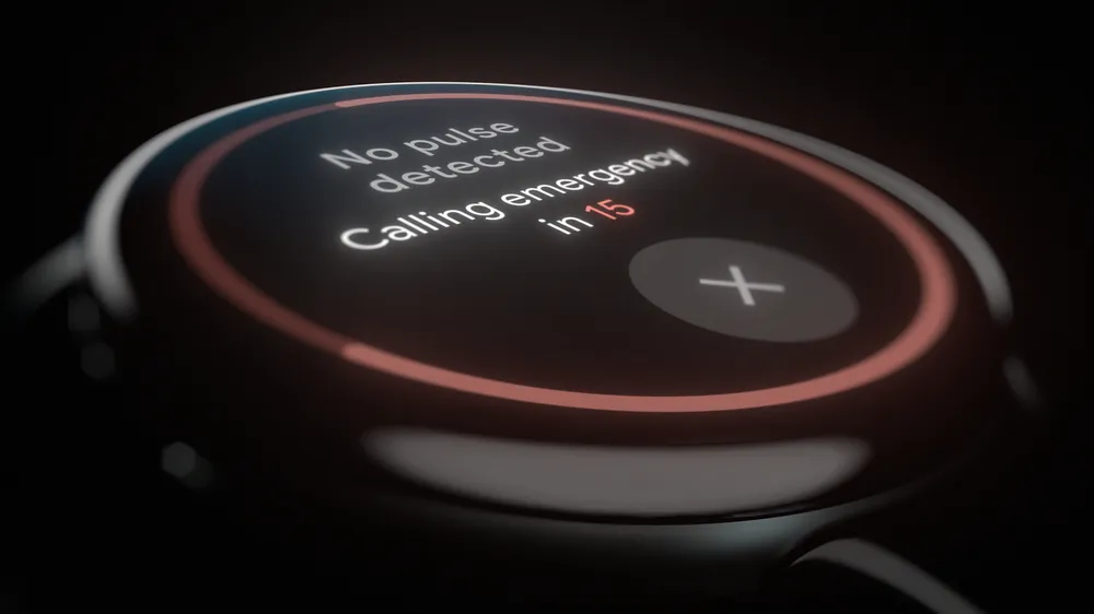
Okay so this was a really cool feature and a great add to the new watches. It’s something unique to the Pixel line, leveraging their unique ability to check heart rate way more often than the competition. From a product standpoint, great addition.
I would skip this part if you’re uncomfortable reading about medical emergencies
There is, however, one rather glaring issue I find with this feature, and it’s only because of my appreciation for this feature that I feel so strongly about this: the feature is functionally useless as they explained it. So, when the watch detects a loss of pulse event, it will wait for 20 seconds and then call EMS to come help. The problem? EMS response times are nowhere near fast enough for that to work. When your heart stops you have, at best, 2-3 minutes before your brain starts to die from a lack of oxygen, and it’s incredibly unlikely that you will survive a loss of pulse event with the current implementation because EMS cannot get there in 2-3 minutes.
How would I fix it? The watch needs an alarm on it. That’s really it. When the watch detects a loss of pulse event, it needs to alert bystanders that something is wrong and to check the watch for more details. It should notify the bystanders that EMS has been contacted and explain that the bystander should start chest compressions immediately. Then the watch should give an audible indicator for the rate of chest compressions (sing along to “Stayin’ Alive” if you’re ever in this scenario).
While the bystanders may not be trained on CPR, literally anything will be better than doing nothing. Time is of the essence here. I’m honestly not sure about the regulatory whatever around this kind of feature, it may prevent this, but as it stands, I can’t see the feature actually saving any lives unless there happens to be an ambulance down the street.
It is safe to continue reading if you skipped the last section
New Hardware
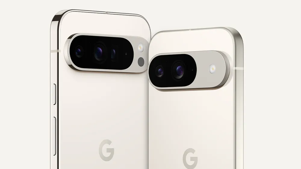
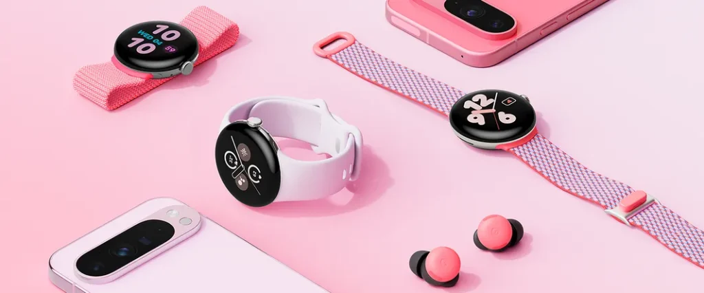
Overall I think the adjustments to the hardware were great. The watch has smaller bezels and comes in two sizes now, which is great, and the phones have struck the same balance between boxy and round that Apple and Samsung have figured out this past year or so. If those devices are any indication of how this will feel in the hand, then it’s going to be great (and it seems that people think so). The only qualm I’ve really seen from people is that it’s not as entertaining to discuss when all phones have the same shape, but all phones are going into the same hands, convergent evolution will do as it pleases.
On top of that, I really like the addition of a Pixel 9 Pro at the same size as the standard Pixel 9, much like Apple’s lineup. You shouldn’t have to have a massive phone to have all of the best features (within reason, physics is a historically hard thing to outsmart).
As a side note, I really think the big phone manufacturers should change up their lineups to not have base models at all, and just reduce the price of their older-generation phones. I understand why they don’t, but I would like it to be that way in the future so here’s me speaking it into existence. Or writing, for that matter.
Lastly, I still think I prefer the form factor of the OG Pixel Fold to the new Pixel 9 Pro Fold (okay seriously Apple and Google need to chill with the suffixes: 16 Pro Max, 9 Pro XL/Fold, it’s like a Sony product). While I preferred the old form factor, the general sentiment online seems to be that people like that it’s moved from the “passport” style to a more familiar “actual phone” style when closed. It’s not my choice, if people like it, then so be it, I’m on board. But I preferred the old form factor.
Things I Didn’t Like so Much
Screenshots App
So it seems like I might be an island with this one, but I didn’t really like the concept behind this app. In concept, I understand why people like it, but it doesn’t feel right for me.
The idea behind the app is that it’s just going to compile all of your screenshots and it will use AI to bring up relevant ones with search. It makes sense, but there’s just something about throwing AI at a pile of junk that I’ve never really liked. (I’m all about relational databases, noSQL makes me uncomfortable for the same reason, I think it might be a neurodivergent thing, but that’s how I feel).
On top of that, I wasn’t really a fan of the demo use-case. They were using it in the context of saving webpages that they wanted to come back to later, but there’s already a much better system that exists: tab groups. I live out of tab groups and I have more than one dedicated to this use case. I’m an organization freak, I understand why people like it, but it just feels bad to me. I don’t want to make a habit of using “we’ll fix it with AI” like “we’ll fix it in post.”
AI Photo Stuff
I don’t really have any new opinions to offer here, I’ll defer to Nilay Patel for this one.
Conclusion
So those are my thoughts after some cooling off time on this event. Overall I think Google has made some great changes to their devices and it seems that a lot of people are really liking these devices, which is good for Google, consumers, and the industry at large. Healthy competition is great for everyone. I’m an Apple user and I’m not going to pretend like that doesn’t affect my opinions on these things, I’m not trying to be unbiased, I’m just offering my thoughts and opinions on the event from an outsider’s perspective who has some experience with product design. If you have any thoughts, feel free to share them on Mastodon or Threads if you’re so inclined.
