I am often asked what my phone’s home screen looks like or what things I have on my home screen, so today, I’m going to break it all down for you. Let me note one thing here is that some of the features that I make use of requires the purchase of Nova Launcher Prime, which I you can grab from the Google Play Store for just $4.99 USD.
Let me start with the basics of what I use as far as a mobile device. For today’s home screen post, I’ll be showing off my Pixel 8 Pro that I use quite regularly. I’m currently running Android 14 Beta QPR3 as I am almost always using beta software of some sort. I choose to use Nova Launcher with Nova Launcher Prime as my launcher simply because it works best for me. Not to mention, I happen to work Nova Launcher and have for 8 1/2 years now. The icon pack I use in the screenshots that you will see below is the OneYou Icons by PashaPuma Designs.
As far as widgets on the home screen, I don’t use any. The search bar you see at the top of the page is actually Nova’s search bar and I use that extensively for searching for my apps that aren’t on my home screen. The reason I search for my apps is because I don’t use the app drawer any longer, though I did for a lot of years. Searching for apps via Nova’s search bar is just much quicker and fewer taps or screen touches in most cases.
Now that we have the basics out of the way, and links to the things I use, let’s get to the meaty details and the things y’all most likely care about the most, my actual home screen.
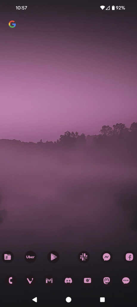
As you can see, compared to a lot of people, my home screen is pretty empty and very basic. I only have thirteen icons in total on my home screen, but there’s access to a lot more apps than just those thirteen.
I’ll start from the top left icon, Solid Explorer, and work my way to the right. Solid Explorer itself is a file manager, and then I have swipe a swipe down action set to launch Proton Drive. This is a Nova Prime feature that allows you to set a swipe up and a swipe down action on icons to do other things. In my case, I simply have it set to launch other apps. This allows me to keep my screen cleaner and more organized for my liking. You can also set swipe actions to launch shortcuts or Nova actions.
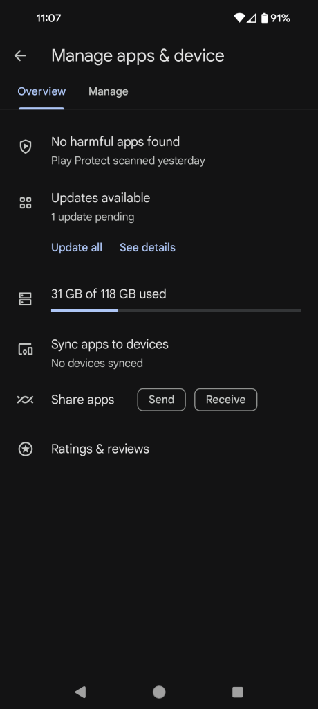
Next is the Uber app. I have no swipe actions set on this icon, so we’ll move to the next one which is the Google Play Store icon. This one I have a swipe down action set to launch a shortcut to My Apps, which is where you go to see all of your app updates within the Play Store as you can see via the image below. Again, this allows me to access app updates without several clicks.
Next up is the Slack icon. Slack is something I use regularly for work but the Slack icon also has a swipe down action to launch Door Dash, since the wife and I order from quite a bit. Then you have Messenger for Facebook, with a swipe down action for Aegis, which is a Two-Factor Authentication app, similar to Google Authenticator and others. Finally on the right side of the top row is Facebook itself. Likely my least used app on the home screen.
On the bottom row, again, from left to right, is my phone app, Vivaldi Browser, Proton Mail, Discord, Camera, Mastodon and then Google Messages. The only icon here that has a swipe action, which is again a swipe down action, is the Mastodon icon and the swipe down will launch Instagram.
Since I only have one home screen, and have for years, unless I’m testing something for a user, if I swipe from the left side of the screen, I can activate the Google Discover feed or the Smartspacer feed. Smartspacer integration is only available in the Nova 8 beta builds currently, but will also be available once Nova 8 gets to a stable release, which will hopefully be soon. One thing to note here is, if you want the Google Discover feed, you’ll have to install the Nova Google Companion APK manually, which you can get from here: Nova Google Companion App.
I would show a video of me accessing the Smartspacer feed integration, but unfortunately I’m using an internal Nova dogfood build that would show things that we have yet to announce publicly, so you’ll have to use your imagination of how things look and work.
As I mentioned early on, I don’t use the app drawer. In fact, I can’t stand having or seeing an app drawer. While I kept mine very well organized with folders and all apps within my folders, it’s just something I don’t care for any longer as I’ve learned to use Nova search for most everything. For me personally, it’s quicker and easier and often just a tap, type one or two letters and then tap the icon I want. This doesn’t work well for everyone, so I encourage everyone to use what they like and what works best and quickest for them.
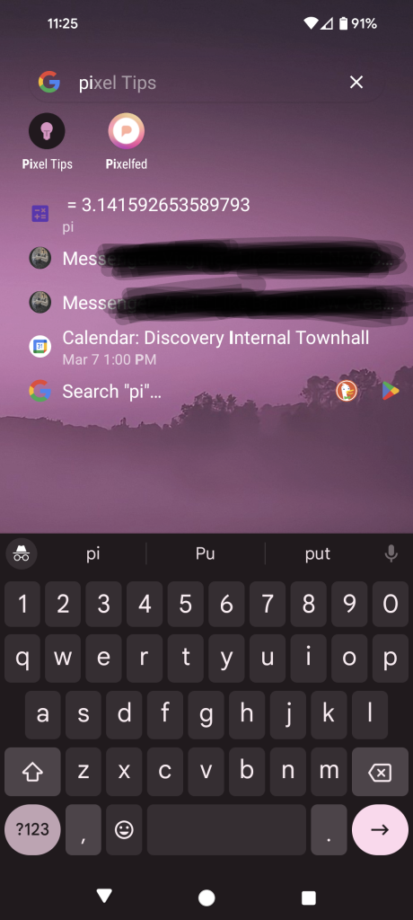
As you can see in the image above, I can type the letters “pi” and find Pixelfed or Pixel Tips. This works very effectively for me and it also gives me other results that I might need to know about, such as a work meeting I have at 1pm EST today. You’ll also notice the search return for pi. These are Nova’s micro-results that we have quite a few of them.
That’s my home screen, explained in detail, and how I use it as well as how it works best for me personally. I’ve used a very similar setup for numerous years with only small minor changes here and there. The layout of my home screen icons has been the same dating back some 8 – 9 years and I have no plans to change that layout any time soon. I know exactly where everything is and it’s super easy and quick for me to access what I need at any given moment.
If you have questions or comments about my home screen, or just about Nova Launcher/Nova Launcher Prime in general, please don’t hesitate to ask. You can leave comments or questions in the comment area below or you can tag me on Mastodon and I’d be happy to share my thoughts there. My Mastodon account is here: Cliff Wade on Mastodon.
Disclaimer: The views expressed in this blog post are solely those of the author and do not represent any official endorsement by Nova Launcher or any other apps mentioned.
Featured Image Credit: Wallbase.cc
Screenshots Credit: Cliff Wade
