Today I got the chance to head over to the Apple Store and check out the new Macs that were announced as part of Apple’s “week of Mac releases” as they called it. I didn’t end up buying anything other than a Magic Keyboard with USB Type-C, though it was definitely tempting. I’m not going to go too much into detail about ordering options, specs, etc. because I haven’t purchased or used any of these devices extensively, I’m just going to be talking about my experience seeing these devices in-person for the first time.
If Apple would like to send me review units, I would gladly take a look, but we’re not there yet.
iMac

The iMac was the first device to be updated during the week and honestly there’s not a whole lot to talk about. I didn’t get the chance to see one with the nano-texture display in-store, but they had plenty of other devices with the nano-texture and I have to say I’m becoming a bit of a nano-texture convert. I used to be all in on glossy displays, but this might convince me to nano-texture all the things.
Colors
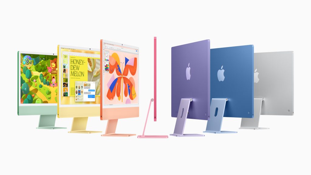
Other than that, I can really only speak to things like the colors. To that end, I actually really like the updated colors. I wasn’t personally a fan of the iPhone 16 colors, as I mentioned in my previous hands-on, but these ones were nice. On top of that, the color-matched USBC accessories were a nice touch. It’s just a shame you can’t buy those as standalone products. I personally like this black and silver model (though I wouldn’t mind a Space Black chassis, that would be really nice), but it would be nice to have that option.
Peripheral Quirks
A weird thing is that it doesn’t seem like you can configure the iMac to come with both a Magic Mouse and a Magic Trackpad, it has to be one or the other. As a three-input user I think that this is sad, but I’m also not the target market for the iMac. Without being able to purchase color-matched accessories after the fact, however, this means you cannot have a full set of color-matched Magic peripherals with your new iMac. Which is sad.
Mac mini
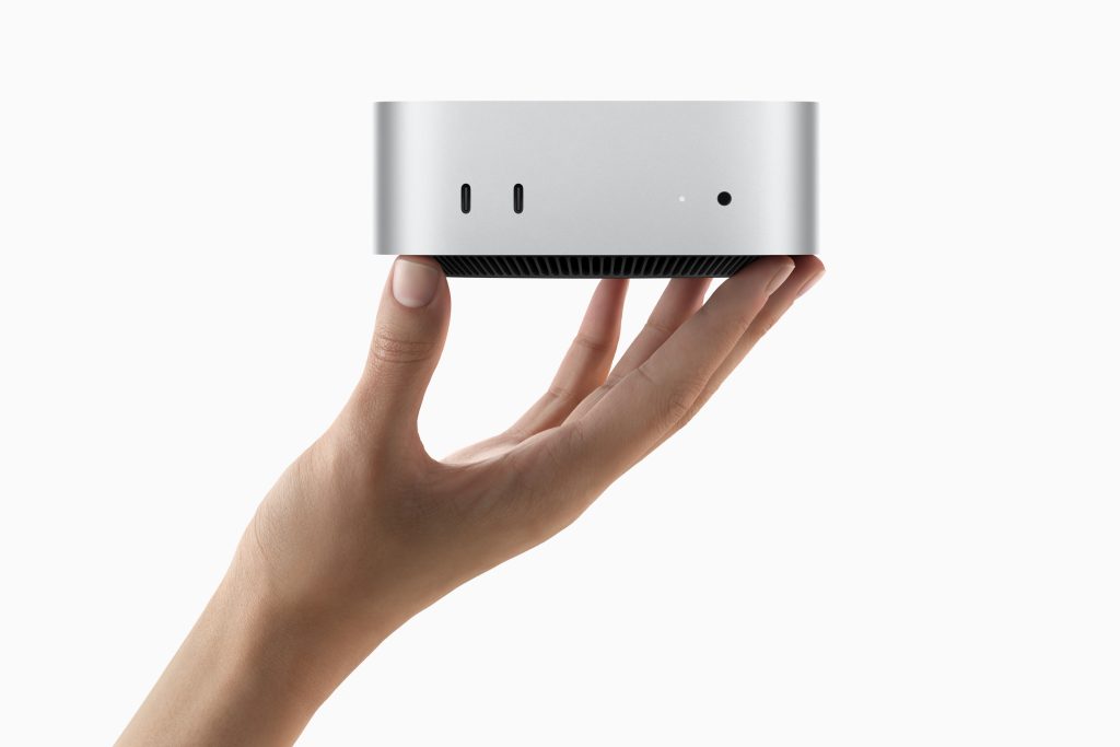
The M4 and M4 Pro Mac mini were the biggest change to any of the Macs during this week of releases with a completely redesigned chassis that I love. The thing is super small, fitting in the palm of my hand, and it can fit pretty much anywhere on or under a desk.
Ports
I love that the Mac mini has ports on the front now. This is honestly super nice from a usability standpoint and I really don’t think it compromises on the design of the device at all. While I appreciate what Jony Ive did for Apple’s software design (as someone who never liked the old skeuomorphic designs of Scott Forstall), Ive really made a lot of compromises with hardware design that didn’t really need to happen. Having these three ports on the front makes everyone’s lives just that much easier and I always appreciate those little details more than having the super clean (and visually boring) front of the old model.
Power Placement Predicament
So we all know the power button is on the bottom. Cool. Whatever. You don’t need to be turning off your Macs with the hardware button all that often. Use the software toggles or schedule it. And, by the way, I had a harder time finding the Mac Studio’s power button than this thing’s. It’s really not an issue of significance and the fact that this is the controversy with this device is a testament to how great it is.
MacBook Pro
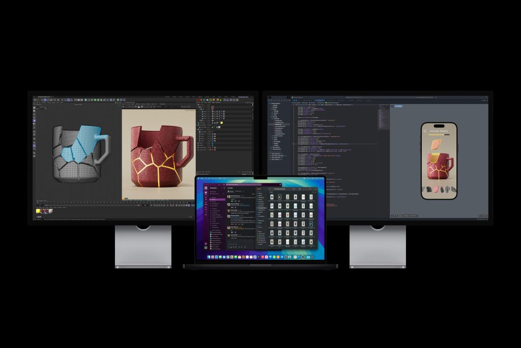
These machines are Apple’s bread and butter for the Mac line at this point. I really love these laptops, even if I’m currently rocking an M2 MacBook Air, even if it’s not really holding up to the development work that I do now (it was the right device for the time, I talked about that in my 1-year later review). The designs of these devices didn’t change really at all. The only notable differences were really that the M4 MacBook Pro now comes in Space Black and adds the third Thunderbolt 4 port on the righthand side of the machine. Other than that everything is pretty much the same.
Nano-Texture Display
Okay looking at this in-store really changed my outlook on nano-texture as a whole. I used to not like matte displays (my current display is matte), and previous iterations of the nano-texture coating haven’t been perfect, but this MacBook Pro I was looking at in-store was nice. There was no color fringing like I’ve seen on the Studio Display when it’s showing pure white. It doesn’t look like it’s greasy like the Studio Display can (again, while displaying pure white, this is largely mitigated with dark mode, which I use). Overall I really like that the nano-texture coating is coming to more displays. It works really well and I hope the improved coating can come to an updated Studio Display and Pro Display XDR (maybe with ProMotion now that M4 Pro and up support Thunderbolt 5…one can dream).
Conclusion
Overall I think the hardware from this series of releases were good upgrades. M4 Pro and Max supporting Thunderbolt 5 was an awesome surprise that I’ve personally been waiting for since the spec was announced. While I don’t think I will be buying any devices from this event, I’m looking forward to see what Apple brings with the updates to the Mac Studio and any other devices, along with what Apple has in store for the M4 Ultra and on. Did you buy anything from the event? Are you considering anything from this event? Are you morally opposed to buying anything from Apple and need to tell everyone about it? Let me know down in the comments or over on Mastodon.


1 Comment
Great write up Sam! I need to resist buying any of the new M4 stuff, especially the Mac mini 😆 It looks pretty sweet.