So I don’t really have a set plan for this post, I’ve usually at least got some notes that I like to go off when writing these articles, but this one is going to be off the cuff. For this post I want to talk about this concept of a “digital home” that I’ve been thinking about for a while.
What is a Digital Home
So I just spent the last 4 years of my life in college living in dorms and apartments and this is actually the base of comparison I’m going to use for this digital home. A dorm room can be kinda crappy, it’s not perfect, but it’s what you’ve got to work with. The best way to make a dorm work is to make it a place where, no matter what, you can come back and recharge. You’re not meant to live your life in the dorm, you’re meant to go out and hang with friends, go to class, maybe a job or a sport. The dorm room has the essentials, it’s your home base.
A Quick Note: Personalization vs Customization
For the purposes of this post, I’m going to make an important distinction between customization and personalization. For the purposes of this article, personalization will be utilizing built-in features to organize pre-existing components. Most of the stuff I’m talking about here will be personalization, not customization. On the other hand, customization will be extensions to the intended functionality of the feature.
Things like organizing your Home Screen, or Control Center, etc. I am going to consider personalization whereas changing something like the system font, or any form of jailbreaking would be customization as it is outside the intended scope of the features available to you on the device. Okay moving on.
Okay so what does this have to do with anything?
I’ve been trying to find the perfect Home Screen setup for a while. I’ve played with having a ton of apps, I’ve played with having no apps, I’ve played with just widgets, and I’ve utilized Apple’s newfound ability to actually put apps wherever you want on the Home Screen (how novel). Even with all of this playing around I never felt like I struck the right balance between all of the features I had at my disposal.
There’s the Home Screen where you can put a ton of apps and widgets and stuff, but there’s also the Lock Screen where you can have some widgets as well. On top of that there’s the Today View on the left and the App Library on the right of your Home Screen(s) as well as the Control Center. It’s honestly a pretty extensive set of canvases for personalization. I don’t like feeling like any of these surfaces are being underutilized so I’ve been spending years trying to come up with a good way to do so and I think I’ve cracked it (for me, obviously). This isn’t going to be a set of rules, I’m really just showing you what I’ve done and how I think about the different surfaces on the phone.
My Setup
Lock Screen
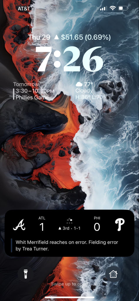
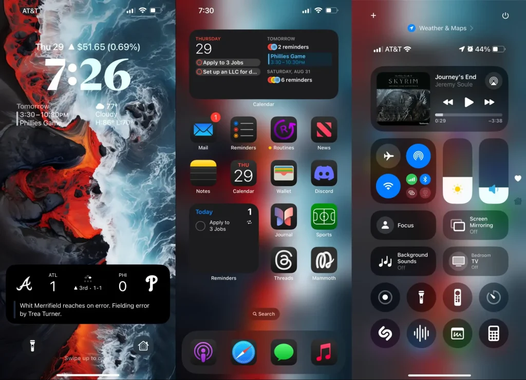
So my lock screen is fairly simple, I’ve got three widgets: my stock portfolio up top, calendar on the left, and weather on the right. At a glance I can get a good amount of information here, it’s helpful for the “I’m about to step out of the house, what do I need to know” kind of thing, and that’s mostly what I use the Lock Screen for. Down below, I’ve kept the flashlight button, but I’ve swapped the camera button for Home. I’ll be honest I don’t use it a ton and I can see it changing in the future (maybe with one of my own apps in the future…I’ve got plans). I never liked having two methods for accessing the camera from the Lock Screen, so I’ve just kept the one I can’t change. These buttons are the things I need quick access to, with the stipulation that I can quick access Robinhood, Calendar, and Weather from their respective widgets.
Home Screen
Widgets
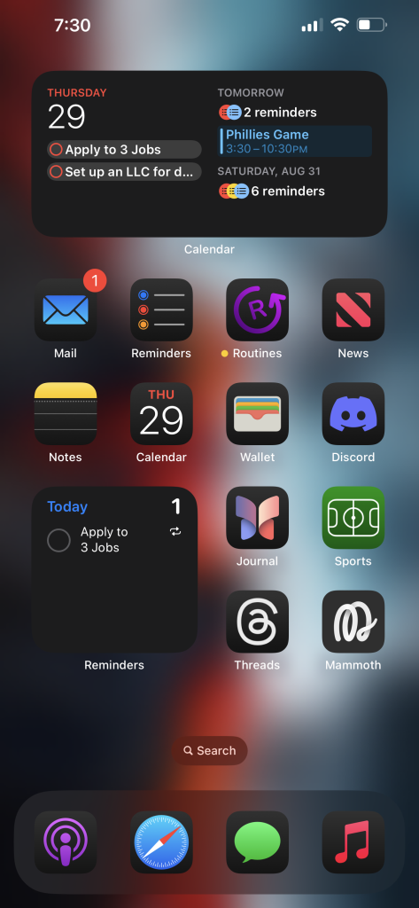
My Home Screen is not necessarily what I would consider a minimalist dream, but at the same time, it’s rather simple. I use a lot of Apple’s stock apps, I don’t find that I really need more functionality than these apps provide (and when I do, I find that I will typically build it). Up top I’ve got my calendar. Simple. It gives me an overview of what I’ve got going on. I don’t think I really need to go into more detail there.
Then I’ve got a Reminders widget down on the bottom left. I pretty much live out of the Reminders app. I schedule a ton of different tasks that I have to get done and the day on which I want to do them. I don’t typically get more granular than the day, I don’t like having that much structure in my life. As long as I check the things off the list I don’t care when they get done. I know a lot of people swear by time blocking for productivity, but I hate it and end up getting nothing done. This is a place where I really benefit from less structure.
Apps
So I’ve got the stock suite of Apple’s productivity apps: Mail, Reminders, Calendar, Notes. Also from Apple I’ve got News, Journal, and Sports (yeah I actually use that app). The only apps I’ve got that aren’t from Apple are my social media apps: Discord which is actually my main communication app, especially with my friends (there’s about 50 people in that server, group chats would not have worked well). Then I’ve got Threads and then my Mastodon client of choice: Mammoth.
Last, but not least, on my Home Screen is my own app: Routines. This is what I was referring to earlier about building the solutions where I feel Apple’s don’t hold up. Routines is a really simple app that I use to keep track of things like my morning and evening routines (hence the name). Routines takes a single piece of functionality from Reminders-repeating reminders-and builds it out into a whole app. Why? It keeps those things from showing up in my Today list in reminders. You can read more about why I built the app over on its website.
Dock
So my dock is largely unchanged since I first got an iPhone Touch 4th Generation way back when. Mainstays are Safari, Messages (it’s not “the iMessage app”), and Music. Recently I’ve added Podcasts and moved Mail onto the Home Screen. I don’t know why, I just liked having Music and Podcasts in the same place. That’s all I have to say about that.
Today View
I’m not going to actually show this because it’s got a ton of sensitive information on it that I don’t think needs to be shared on the interweb.
Overview
This is where I keep all of my “at a glance” information. I stay really on-brand for this one: it’s just a bunch of info about the day. Up top we’ve got a larger weather widget, then batteries. Below that I’ve got some health stuff: my food tracker, Foodnoms, then the Vitals widget from the Health app. Below that is a hydration tracker, Waterminder.
Below that is the productivity stuff I guess I would call it, starting with the “Today” widget from the Mail app (again, staying very on-brand here). Below that is the super long News widget as well as the large Stocks widget to get all of my news at a glance.
From there we go into finance: I’ve got the Robinhood portfolio widget and the Apple Card Balance widget side-by-side, below that are two widgets from my budget tracker, Copilot: one to review recent transactions and one to show my budget categories.
Next we’ve got travel with Flighty and the Maps widget, and then the Find My widget below them.
Lastly is the ScreenTime widget.
Additional Thoughts
So there’s a lot there, I know. It actually takes quite a bit of scrolling to get through the whole thing, so I try and rank them by most to least used. Right at the top I can see everything from the Weather widget to Waterminder without scrolling, which are my most used widgets in the Today View by far. From there it scales by importance. It’s a fairly simple system, some of the widgets may move around in the list, but it’s working.
Control Center
This is the newest personalization canvas for iOS 18 (though you could do a little bit beforehand). I actually keep this looking a lot like the stock one with some notable changes.
First Page
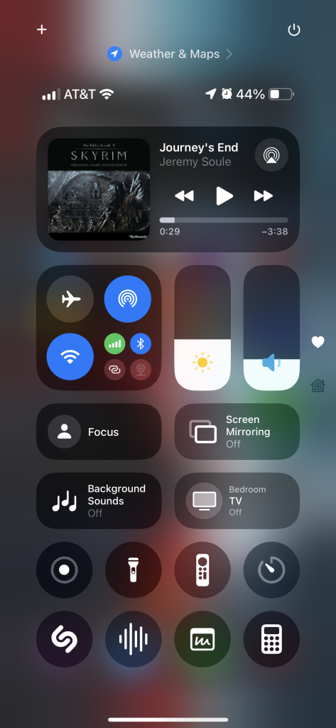
Up top we’ve got the medium music widget for full playback controls, progress, and the like. I don’t actually interact with it a ton, this was mostly a design choice. From there we’ve got connectivity, brightness, and volume. I kept the sliders where they were because that’s where my thumb sits. Connectivity sits as close as possible to where it was originally having been replaced by the longer music widget. I actually really only use the brightness slider to toggle dark mode, but I chose to go with the brightness slider because there are a few times where I need to adjust the brightness, but mostly I leave Auto Brightness to do its thing.
Then I’ve got my larger toggles for focus, screen mirroring, background sounds, and my TV. I use focus modes quite a bit, I’m really getting into the Reduce Interruptions focus, which I can actually still set on my iPhone 13 Pro Max despite not having Apple Intelligence. I don’t know how that works, but I’m not complaining. Then I’ve got mirroring, which I really only use on occasion, and background sounds, which only exists in the larger size button because the glyph is not recognizable whatsoever.
Then I’ve got Screen Record, Flashlight (for when I’m already using my phone), the TV remote, Timers (you can quick select times with Haptic Touch, though I find I’m using Siri for a lot of timer stuff). Then I’ve got Shazam, Voice Memos, Quick Notes, and Calculator.
I don’t really have a lot to say about this, it’s still a little in-flux, but it works.
Second Page
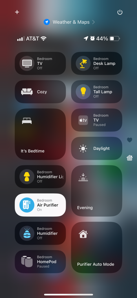
I literally just took the Home button and made it the size of the whole page. It moves the buttons around all the time. I could set them specifically, but I don’t really care enough to do so. It works. I don’t know what to tell you.
Extending This Thinking
This “Digital Home” thing doesn’t necessarily have to be one place for you. I’ve got my phone’s setup as an example here, but I’ve also got my desk setup acting as another facet of my Digital Home. The core idea stays the same though: focus less on making it “minimalist” or whatever and focus more on putting things where you need them when you need them. Use what’s available to your advantage. If something isn’t working, think about why, then change it.
Does any of this actually make sense to you? I really hope it does. Feel free to share your Digital Homes here, or mention me on Mastodon or Threads.

1 Comment
Pingback: The Fediverse is Not a Technology—It’s an Idea – AllThingsTech